GIG members' data analysis, by Emily Powell
As part of my role as Membership
Secretary (Consider joining us, it is fun and might remind you why you wanted
to be an information professional in the first place!), I am looking at who our
members are and how I might engage with them. I am hoping through 2024 to be
more active in the second part, but for 2023 I have mostly been focusing on who
our members are.
This year I have looked at data
snap shots in January and October. Any GIG member can see the current
membership of GIG in the members area of the CILIP platform - although this
number does not tally with the reports in the back end. In January we had 636
members (580 in the reporting data) and today we have 672 (562 in the reporting
data). So, by one metric our membership has gone up by 36, by another down by
18. This is, I am assuming, related to whether people have opted into certain
data collection, but I am trying to clarify with CILIP.
Let us go with the positive figure
that is available to everyone which shows GIG has had a 5.6%-member growth
since January.
Possibly not bad considering there
are 582 members of the GKIM Knowledge Hub community?
For the rest of the data, I am
mostly going to go with October’s, as there is not much point in trying to
compare. So, let’s start with the sector break down.
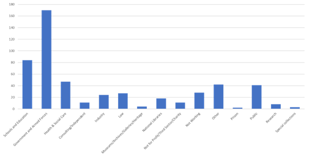
About a third of our members are
from the Government and Armed Forces sector. I do not suppose we can know how
many CILIP members there are in government so it is difficult to know whether
we have cornered the niche! Next it is schools and education, and then a fairly
bobbing distribution between the other sectors which is really positive. I
expect this chart is the one with the data that is most unique to our group,
but it would be interesting to be able to compare.
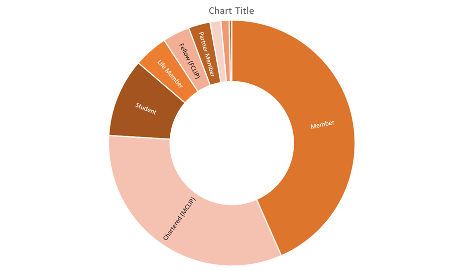
The next chart is membership type.
Most are CILIP members or Chartered
members. There was a slight tick up in students for October, perhaps showing
our recent webinars have boosted numbers in this area? A complete guess, but
I’d be interested to hear from any students who have joined recently and why.
The second to last chart is on age
distribution, though it should be said this is the least complete of all the
data! Clearly librarians are not keen on sharing their age...!
I think in line with much of the
information profession, we have a data bulge at the closer to retirement end. However,
having heard that Libraries are going to face a retirement tsunami soon every
year since library school I am not going to read too much into that. I am
particularly impressed by the forty six 71 and over members, 25 might be life
members, the rest just really dedicated? And me barely able to open a
PowerPoint twice a year…
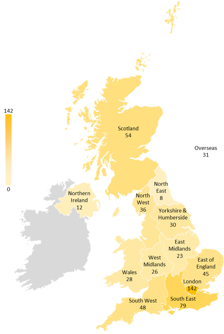
Lastly, we have regional spread,
which is the chart I am most proud of because I had to get a PowerPoint
extension and everything. What does it tell us? That about a quarter of our
members are in London, a third, if you bring in the South East region. I think
that seems to fit with job and population distribution. The 31 overseas are
perhaps the most interesting, with 1 Africa, 9 Asia, 4 Australasia and 5 North
America counted alongside 12 Europeans. Hopefully we have provided something
valuable to the international community!
So that is the current membership
of GIG, all that we are able to know about you. As you can see it is fairly
surface stuff, that is why your blogs, comments and engagement are so important
to us. Please do comment any thoughts you might have or get in touch, if you
have any great suggestions on how we can engage better with the GiG membership
-You!


Comments
Post a Comment